


I've Found The Worst Campaign Website In the History of Campaign Websites
I've Found The Worst Campaign Website In the History of Campaign Websites
There are bad campaign sites. And then there's this Hot Mess

Campaign websites are funny things. They provide an insight into what makes a candidate and a campaign tick. They often tell us which candidates are serious candidates and which candidates are not.
If you remember a few months back I wrote about how Jerome Segal’s website shows to us why socialism fails. And yet here, two months later, I have found a campaign website that’s somehow even worse than that.
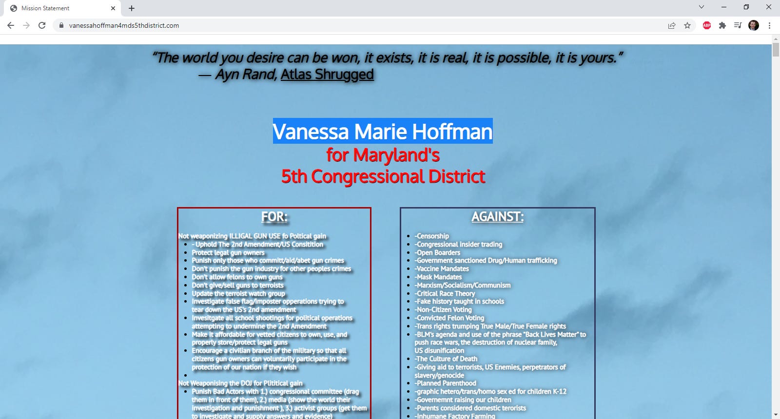
This site is a tour de force of words and terrible backgrounds. What you see above is pretty much what you get. Almost the entire site is a column on the left as to what Miss Hoffman is for, and a column on the right as to what Miss Hoffman is against.
There are Charles Lollar and Dan Cox levels of spelling errors on the page. Some of the more interesting examples include…
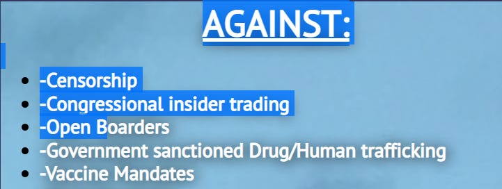
Being Against “Open Boarders”; I know that I’m against dissecting people who stay as guests in people’s home.
Here, Hoffman is against “illigal guns” and “terroists”

Don’t get me wrong; most of the content and proposals of what Hoffman is for is batshit in addition to being misspelled.
While many of us are against Roe v. Wade, Hoffman does not want to have a rowing competition against Wade? Maybe?

She’s also against…..whatever the hell that last sentence means, the entire thing is misspelled.
But at least she doesn’t want the Justice Department being used for…. “Plititical gain”

At least she wants us to interpret the “US Constitutional” as the founders intended, all while excusing those who participated in the January 6th coup d’etat attempt.
And yes, it gets worse. Here is the second section (we’re still on the same page here) this one about “Humanity at a crossroads”
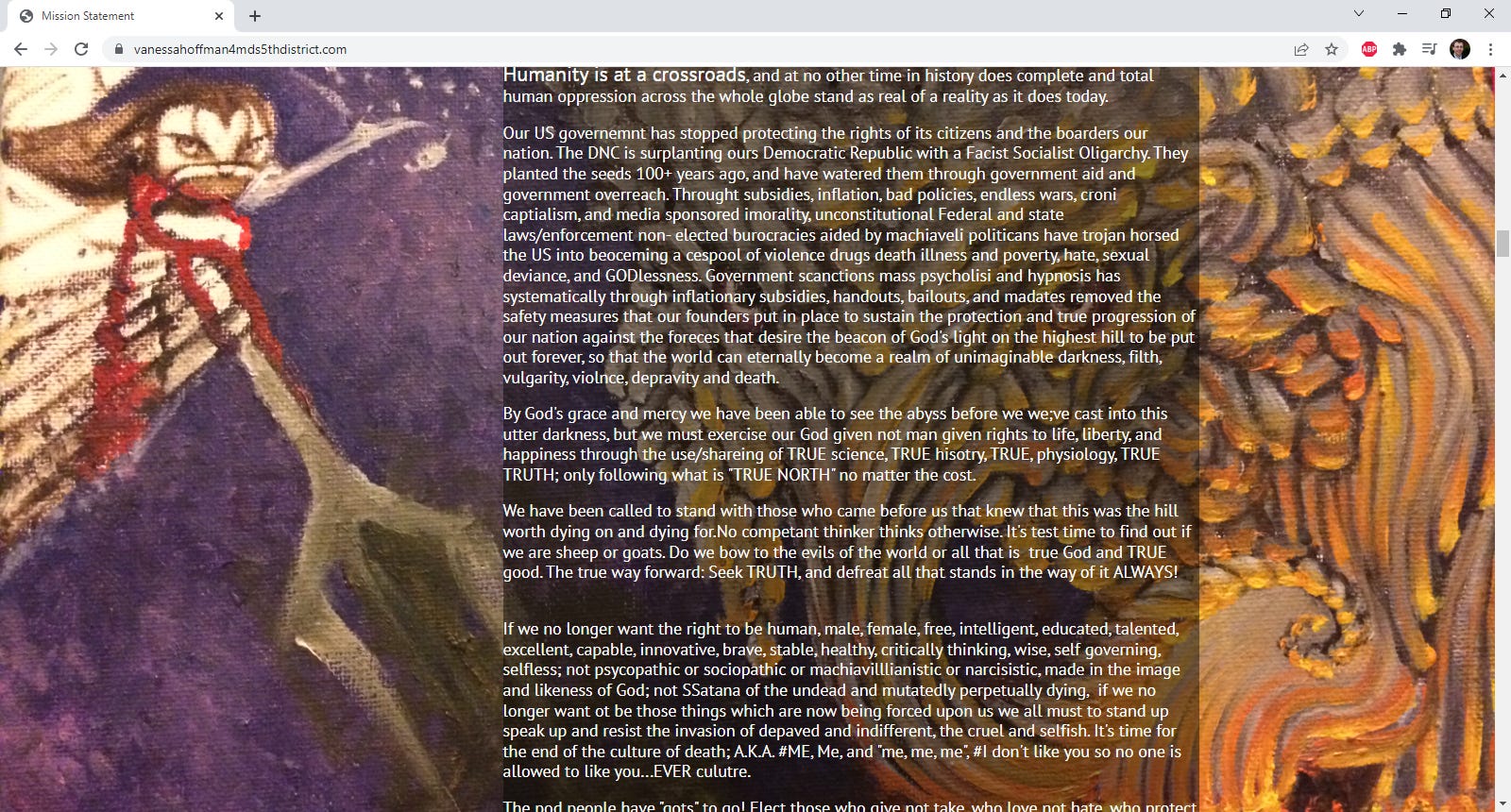
Don’t see too many references to…..is that Santana? Or is it Satan misspelled?
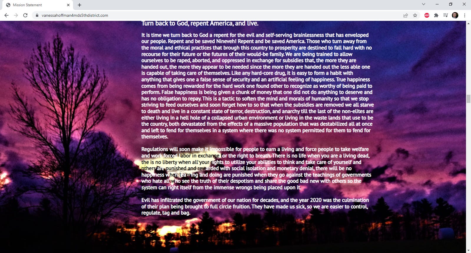
But we’re not done, let’s go one to the mind control section.

Yes, we have section after section of small text on bizarre, barely readable backgrounds. We even get a section where the text color got changed in mid-word because of the terrible background photo used.
We’re less than halfway through the thing, but you get the idea. It’s bad on a desktop. It’s even worse on a phone. Where it takes nearly a minute just to scroll it, to say nothing of reading it
All in all, this has to be the worst campaign website I’ve ever seen. And I have no idea somebody could make a site that would be somehow worse.
We need Republicans who make sense.