


Let's Rate the Gubernatorial Campaign Logos
Let's Rate the Gubernatorial Campaign Logos
Design doesn't make the campaign. But it helps.

Logos are always a fun way to evaluate the campaigns, figure out what people are about and what the vibe of their campaign. So with apologies to Don Murphy, let’s take a look at the campaign logos for the declared candidates for Governor, rated on a 1-10 scale.
Dan Cox

This design is really, really good. It’s very bold, very readable. The logo highlights the name very easily. I always like white signs with a very distinguishable color, which red on white is. It actually looks a lot better on a yard sign that it even does with the on-line version.

The mistake the Cox campaign made was changing the sign design when they added Gordana Schifanelli to the campaign signs. Cox is a lot smaller on this version of the logo, and the entire thing gets crowded when you jam the website on there, which is just superfluous.

At least they spelled her name right this time.
Rating: 10/10 for the main logo. Only 5/10 for the Cox/Schifanelli logo.
Robin Ficker

Robin Ficker has been consistent about cutting the sales tax two cents going at least back to his U.S. Senate campaign in 2000. Not that running for Senate has anything to do with the U.S. Senate. The problem for this sign is the fact that it gets crowded. The black on yellow is a great and readable choice. However, the entire point could have been made by making the pennies and the website smaller, and making sure that Robin takes up the entire width of the logo. It’s good, but ultimately it’s a Christmas tree with too many ornaments.
Rating: 7/10
Kelly Schulz

The online logo and the “real-life” logo are a bit different. The above version, online, is a black background and it is very reminiscent of the Hogan 2014/18 logos. The “real-life” version so far on bumper stickers, signs, t-shirts, etc. has a white background.

The logo itself is fantastic. The “Kelly” script of the name emphasizes Schulz’s status as the only woman running for Governor. But that gets a little more lost on the white version than it does the black version. That being said, the white version also pops with the black text-on-white which is incredibly readable at high speed.
Online version (Black): 10/10. “Real-life” version (White): 8.5/10
Joe Werner
This certainly screams like a hopeless lost cause doesn’t it? With so many free tools available these days (hello, Canva?) it is beyond inexcusable to not have something as a logo.
Rating: -100/10
Rushern Baker

Sometimes adding the running mate makes logos clunky. Not so with adding Nancy Navarro to Rushern Baker’s signs. They managed to fit her name on the sign in a very logical and appropriately sized manner without harming the ability to read Baker’s name. Look how readable that logo is.

Rating: 10/10
Jon Baron

It’s……ok? The state of Maryland that is included on here is extraneous. The Jon on this white version is virtually unreadable and pointless. It’s only slightly better with a blue background.
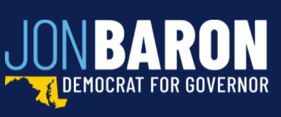
I looked for pictures of either logo in action, but I’m not sure anybody actually supports Jon Baron so I couldn’t find any. This would be a lot better if they eliminated the Jon and stretched out the Baron. But they didn’t.
Rating: 6/10.
Peter Franchot
Franchot *had* a good logo. A really good one. And then they added Monique Anderson-Walker to the logo. And this thing became an absolute mess. First off, putting “Anderson-Walker” on the sign is ridiculously clunky because her last name is too long. There’s a reason why Parris Glendening’s campaigns only went with “Townsend” for Kathleen Kennedy Townsend’s last name.

The other confusing decision here is the fact that Anderson-Walker’s name is rendered in a completely different font than Franchot’s name is. Using multiple fonts is typical to differentiate the name or names from other information on the sign. But this doesn’t. Admittedly, the sign would be unreadable if they used the same front for both names. But that’s a decision that could have been avoided by picking a different font to start with or changing fonts. This is what happens when a good logo gets bungled along the way.
Rating: 4/10
Doug Gansler

It’s interesting that Gansler when with light blue instead of the red his campaign used in 2014. Possibly, it’s to make a clean break with Gansler’s bungled ‘14 campaign.

It’s quite the difference from 2014 to 2022. The change from red to blue is the most noticeable. The actually appear to use the same font in both signs, with different results. But the new version cannot hold a candle to the 2014 version. Having white text on a light blue background makes his name incredibly difficult to read at high speed. Just look at this real world example.

This logo would get very high marks if they used a darker color. They did not, which means that they lose a whole lot of points here.
Rating: 3/10
Ashwani Jain

I have absolutely no idea who thought this was a good idea. Weird shadowing. A state of Maryland that looks like it was drawn by a kindergartner. Jain rendered in a font the same height as the word Governor. Jain is a running a doomed campaign that will be lucky to get 1% of the vote, and it looks obvious with a logo that looks like amateur hour. At least they finish higher in the rating department than Joe Werner did.
Rating: 0/10
John King
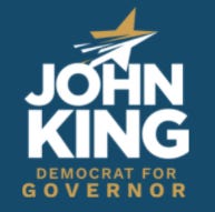
There’s more logos than you can shake a stick at. This logo, above, is on the King website and it looks like somebody was designing a logo for an app.
Then there’s this picture.

Now, you’ve got three more logos here, all of which have different colors. The logo setup on the banner is the best one out there. Looks good on a banner and a bumper sticker, not so much though for a yard sign. But it’s the most normal looking thing out there. Then there’s the t-shirt logo, which is yellow on dark blue. It’s readable, but the color palette doesn’t match anything else going on in the King campaign. There’s a least one person here with a white shirt with John King rendered in yellow, which is practically pointless.
If the King campaign can’t manage their logo usage effectively, how is he going to run Maryland?
Ratings: Square logo: 6/10; Banner logo; 8/10; Dark Blue shirt; 7/10; White shirt; 0/10
Wes Moore
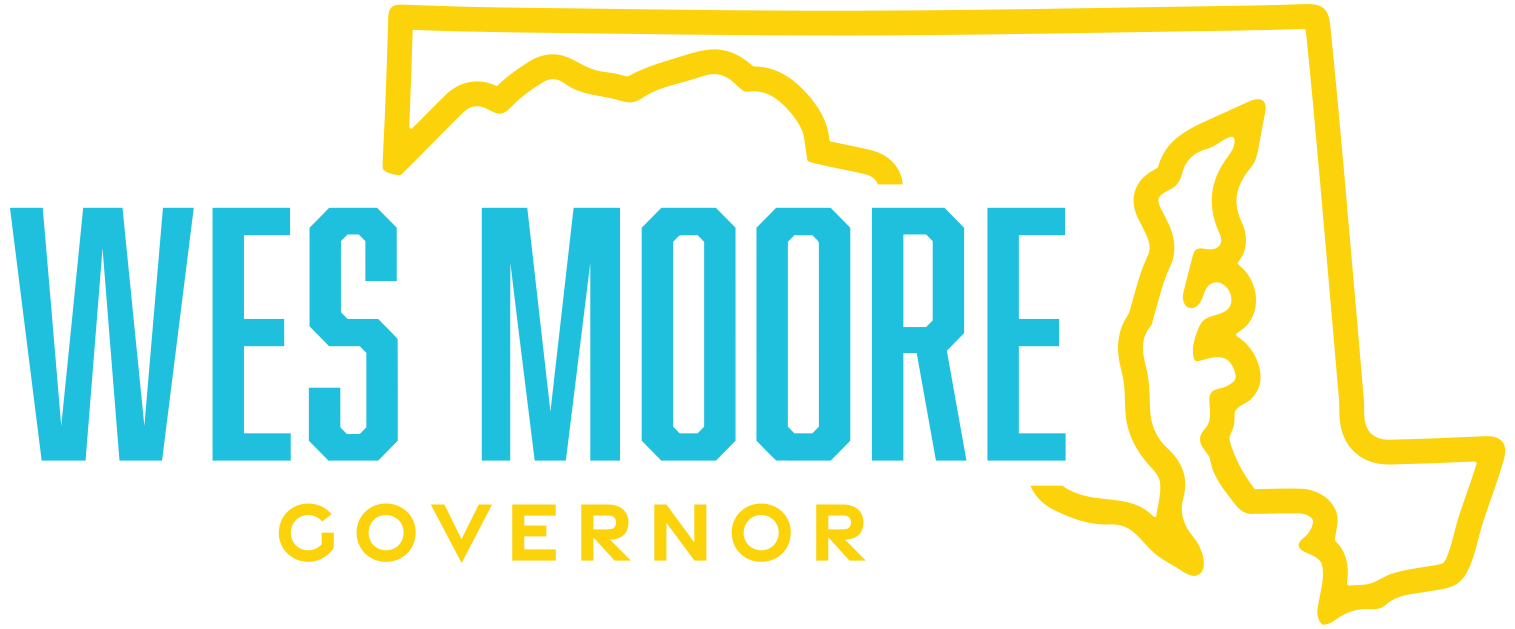
What is any of this? Somehow, Moore’s campaign uses a lighter blue than even Gansler and puts it on white? A blue logo is also used, with the same light blue and yellow logo. Is Moore running for Governor or is he trying to buy the Los Angeles Chargers?
Not coincidentally, they are not using either logo in the real world.

The real-world version looks 1000% times better than the ones above. And yet, it still isn’t by any means good. Look at that banner and think about how much of the space is being used by Moore’s name. The state of Maryland on here is much larger than his name. I think people living in Maryland know that they live there and don’t need the reminder. There are lots of people infatuated for some reason by Moore, but Moore is not infatuated by decent campaign design.
Ratings: White logo: 0/10; Light blue on dark blue: 1/10; Yellow on Dark Blue; 4/10
Tom Perez

Purple? Are you serious that Perez settled on purple? It’s unique, that’s for sure. And yet, the design is still awful. It’s very readable, yes. But why is the “Tom” the point of emphasis here?

Like Wes Moore, look at all of that unused space. Unlike Wes Moore, Perez is a career politician and should know better. Still, Perez’s logo is just a bit better than Moore’s best one. Barely.
Rating: 4.25/10
Mike Rosenbaum

The sixties called….

Or maybe the seventies called…..

Everything about the Rosenbaum logo is bad. The lower case font is fine, very modern, very in line with branding trends. Everything else about it is horrible. The mustard color background. The split colors of the name. The white on that light mustard background. Whoever Rosenbaum paid for this design deserves to give him a refund. Especially now that he dropped out of the race less than twelve hours after the latest Chalk Session dropped, which is surely not a coincidence.
Rating: -1/10
Ed Tinus
As far as I can tell, Tinus has no logo. Not surprising, and realistically I’ll be shocked if he actually files.
Rating: Incomplete
David Lashar

Black text on white background is a fantastic color choice. Lashar also doesn’t make the same mistake that so many Libertarian candidates do which is to try to stand out with branding and design in all of the wrong ways. The libertarian eagle is a nice touch in a manner that does not detract from the overall design.
Rating: 10/10
Kyle Sefcik

This reminds me a little bit of the Wes Moore square logo, where it looks like an app logo instead of a campaign logo. The focus on the Maryland flag and its colors are a good idea of a candidate running as an independent. That being said, the “real-world” version is a more traditional rectangular version.
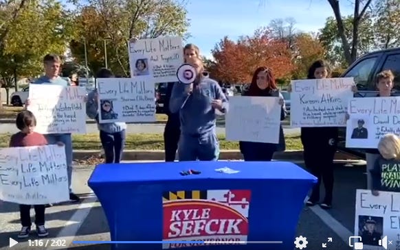
All that being said, this is good but could be better. If the curve was brought up significantly, that would give more space to the Sefcik here. The Kyle and the “For Governor” text is way too big, especially for a candidate that needs to overcome no party support and no name recognition. It’s a very good logo that needs a bit of tweaking in order to be nearly perfect.
Rating: 8/10