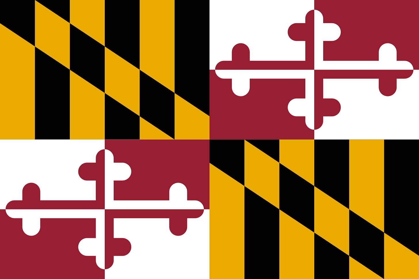
Everybody knows what this is.
But not everybody is familiar with the county flags in Maryland. And yes, each county and county-equivalent (i.e. Baltimore City) has its own flag.
These flags fall into two basic categories:
Cool, unique designs;
Lame, lazy flags that just slapped a seal on fabric.
Some of them are awesome. Some of them are really bad. So let’s rank them from #24-#1.
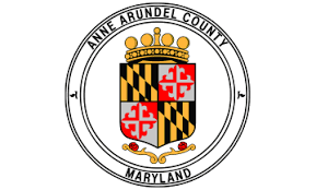
#24: Anne Arundel County
How lame is this? “Let’s slap the seak on a white sheet” is no way to design a flag. Anne Arundel County, my home county, finishes dead last in these rankings because the County Seal is so lazy and lame.
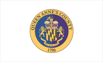
#23: Queen Anne’s County
Seem familiar?
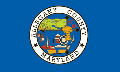
#22: Allegany County
It’s the same idea as Anne Arundel and Queen Anne’s Counties. But in blue.
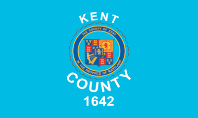
#21: Kent County
The same idea as the others. But also in blue. Points added for the seal that still says “In the Province of Maryland.” Points deducted for SCREAMING KENT COUNTY WHY ARE YOU YELLING>
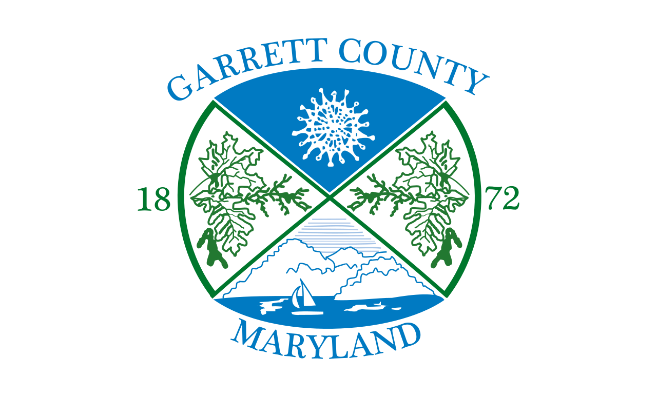
#20: Garrett County
Another seal on white. But this seal is bigger and more colorful. So that’s something.
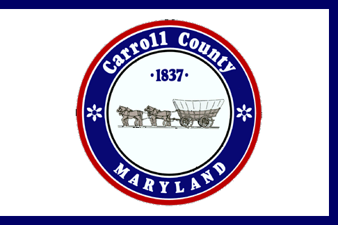
#19: Carroll County
Bonus point for having the blue border to give it some color. But also, I always loved the Conestoga wagons on the seal.
#18: Harford County
This time, we have a variation of a seal. But in blue. They actually figured out a way to have the stuff on the seal, but present it in a pleasing way.
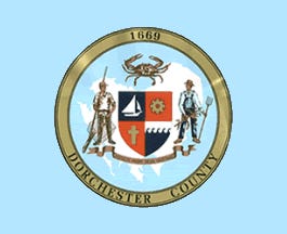
#17: Dorchester County
It’s the county seal. On yet another different shade of blue.
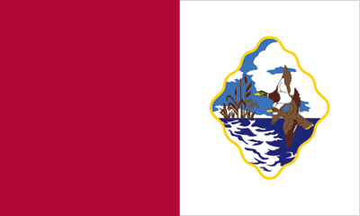
#16: Cecil County
So here we finally have some creativity. It’s the county seal. But offset. And on a multi-colored background. Sure, it literally looks a little like the flag of Malta. But it’s something.
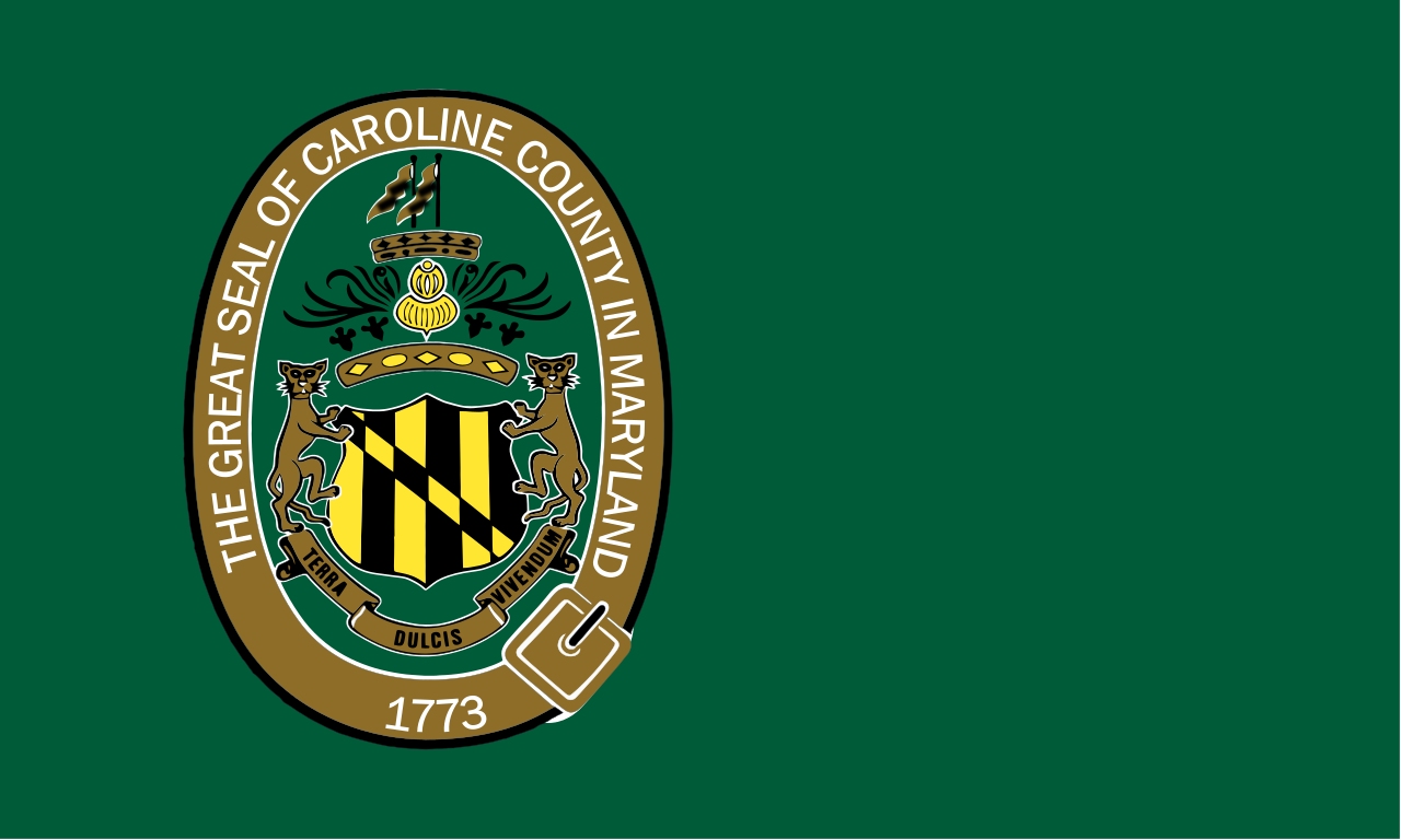
#15: Caroline County
It’s the county seal. But this time, on green. Bonus points for the seal being off-center and the use of a green that matches the seal, which makes this look less lame.
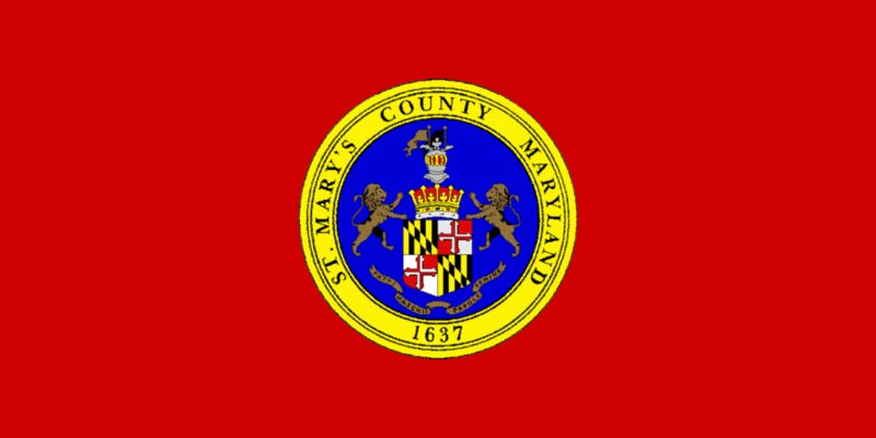
#14: St. Mary’s County
It’s the county seal. But on red, a bonus point earned for using an actual state color.
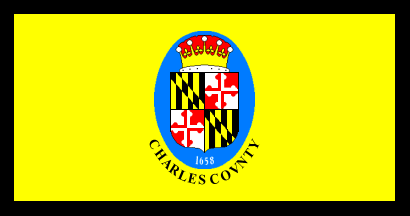
#13: Charles County.
It’s the county seal. But on yellow with black trim. Bonus points earned for using two of our state colors.
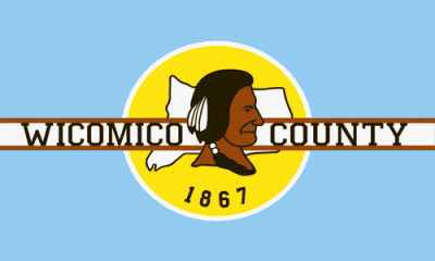
#12: Wicomico County
At least Wicomico County uses a variation on the country seal. You get the same general gist, but presented differently in a way that isn’t just the regurgitation of the county seal. A lot of counties that have punted on trying and just slapped the seal on a banner could learn a lot from this.
#11: Prince George’s County
This time we have a county seal in the canton of the flag, superimposed over the flag of England. I’m not going to try Prince George’s County as much as I am our next entrant, because this is still the Flag of St. George, which is at least tangentially related to Prince George’s County even if the county is named after Prince George of Denmark, who was the Prince Consort of Queen Anne.
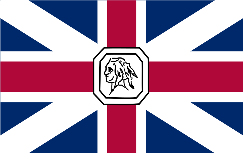
#10: Somerset County
Well, we’re finally out of the county seals portion of our show (which you will note accounts for more than half of these flags). And the first one that we are presented with is this monstrosity. Here we have a seal depicting a Native American slapped on top of the 1702 version of the Union Jack. Did Somerset County not get the memo and realize we won the War of Independence? While it’s not nearly as bad as the ones with country seals on it, it is by far the worst of the rest. Try harder, Somerset.
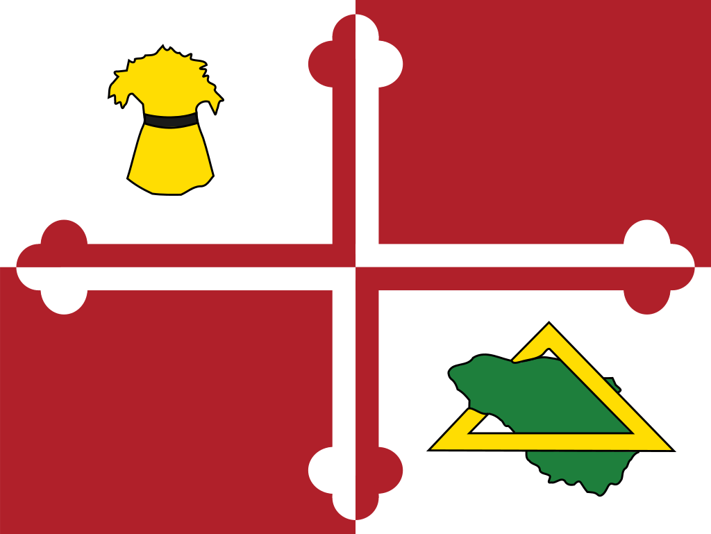
#9: Howard County
Well, they tried. Howard County uses the Crossland arms (big plus) but then superimposes some weird clip art over it. The wheat looks like a rejected 1940’s era for Wichita State’s sports teams. The outline of the county is never not lame. The triangle is even lamer. Surprised some people haven’t tried to link this to the Illuminati. Apparently this won a contest in 1968. I’m assuming that the woke mob that lives in Howard County will start coming for this flag any second now.
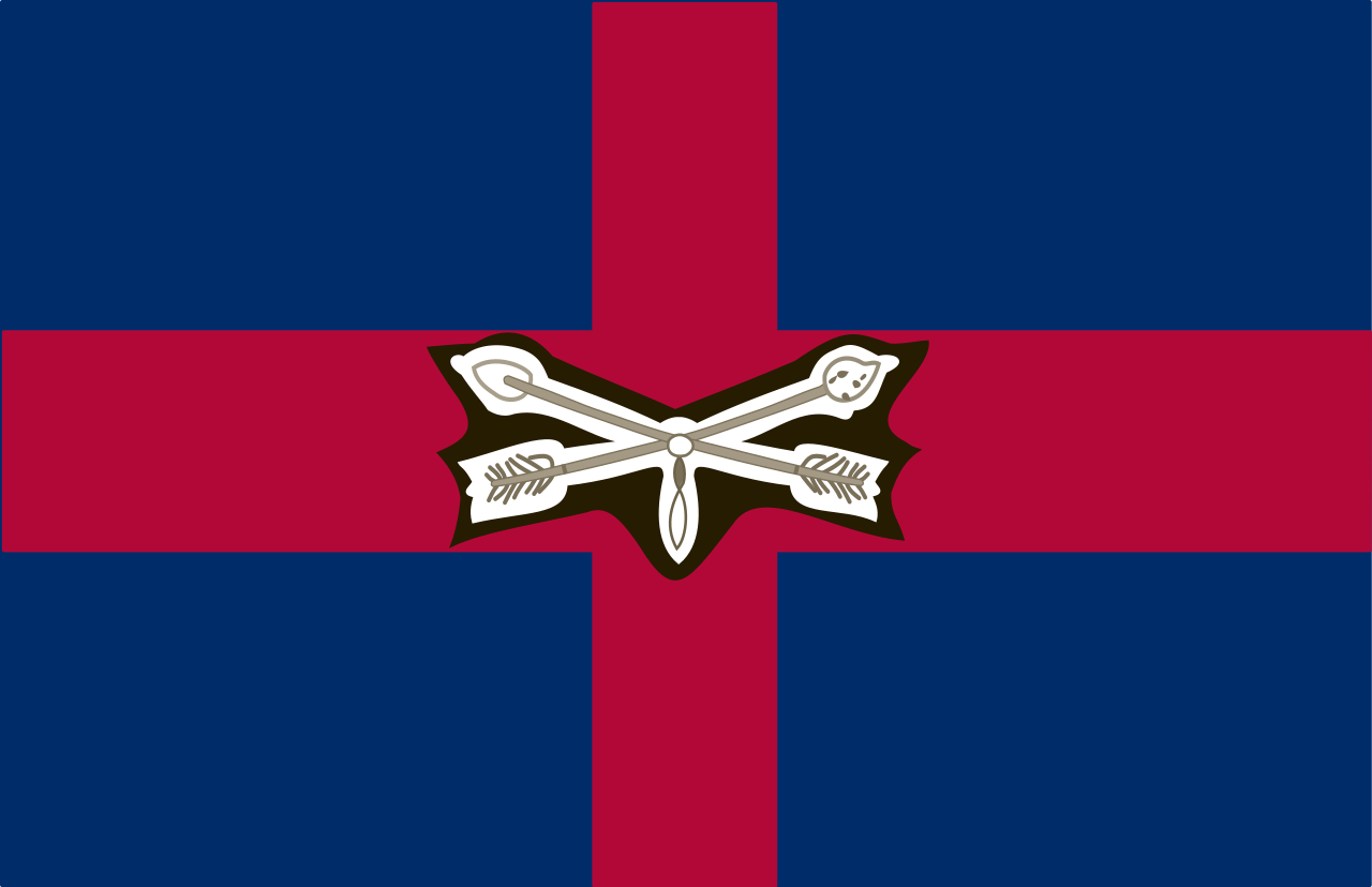
#8: Worcester County
This gets harder now, we’re getting to flags that actually look good. The crossed arrows are a nice touch. It may or may not be a native sign of peace. The darker colors are fun too.
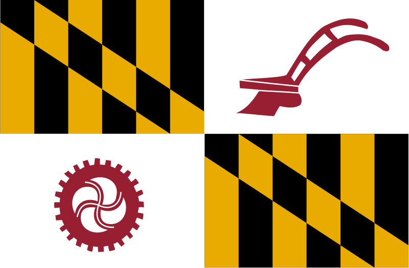
#7: Baltimore County
The Calvert Arms are a logical choice for a county named for Lord Baltimore himself. Apparently, this won also won a contest. It was criticized for being “too communist” which kinda amuses me, but it was also the 1960’s so that checks out as a growing concern. There’s just something about the farm implements that I’m just not a fan of. It might have a lot to do with the urbanization of half of the county and how little agriculture seems to be a valued commodity by county leadership.
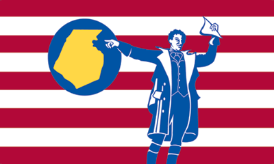
#6: Frederick County
There’s a lot going on here. This also won a contest, this one in 1976. Here we have Francis Scott Key, Frederick County native, pointing at Frederick County. Could probably do without the county cutout, really. The eleven stripes make no sense. All in all, a pretty good design.
#5: Montgomery County
So this one is based on the county seal, which itself is based on the seal of Richard Montgomery, for whom the county is named. So it earns similar points to what the Maryland flag itself earns. But there’s just something about the flag that doesn’t sit well with me. I’m not entirely sure what.
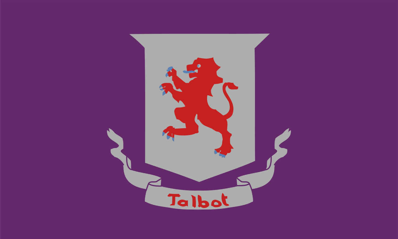
#4: Talbot County
This flag is much better than it deserves. It incorporates the Talbot family coat of arms (of the county namesake, Lady Talbot) and drops it on a purple backdrop. Purple apparently was the color “assigned” to Talbot to the ten original counties in colonial days. It makes no sense why this flag is as awesome as it is. But it’s awesome.
#3: Washington County
I love this flag. I really do. The stylized W that also represents the mountains. The George Washington head. The colors symbolizing land and sea. It’s awesome. The only problem is that it’s too busy. I understand the symbolism of the nine stars (one star for each of the Washington County municipalities), that doesn’t make for a good flag design. Take off the stars, and this probably would have rocketed to #1.
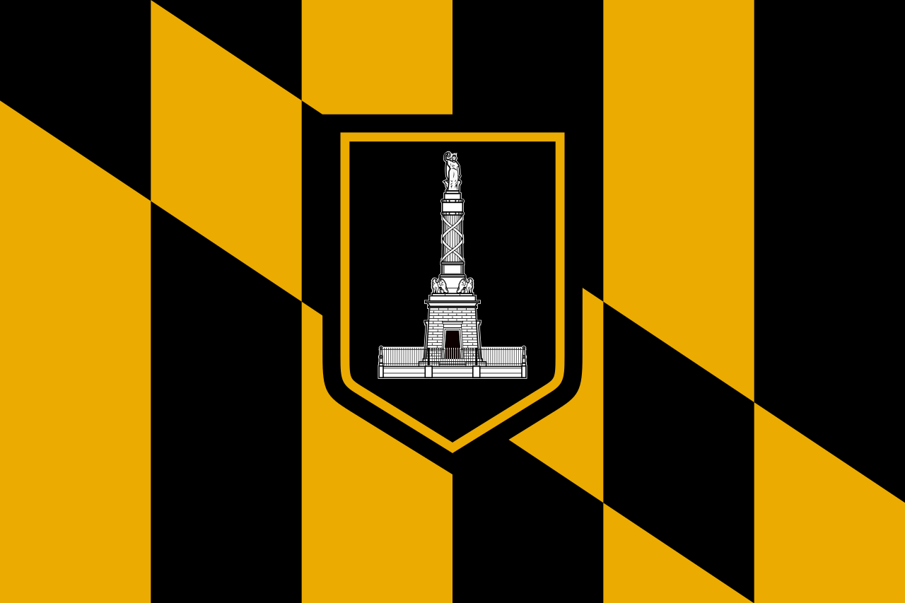
#2: Baltimore City
Again, the Calvert Arms was an obvious choice. The Battle Monument commemorating the victory over the British at the Battle of North Point in the War of 1812 is a fantastic touch. It just finishes a hare behind….
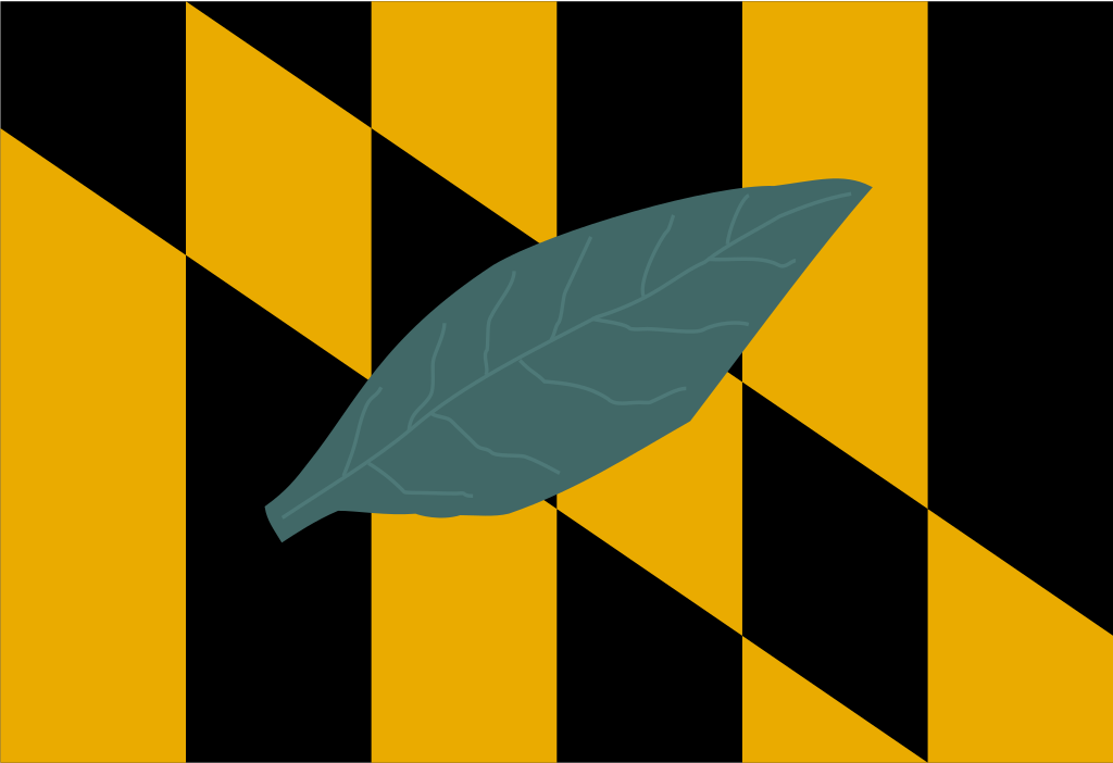
#1: Calvert County
Again, the Calvert Arms was an obvious choice. Calvert edges out Baltimore City on the basis of choosing the tobacco leaf for the flag. Yes kids, tobacco was a major cash crop in Maryland and basically was the backbone of the Maryland economy for generations before the 1980’s happened. It’s that historical link that gives Calvert County the #1 spot.




![[Flag of Washington County, Maryland] [Flag of Washington County, Maryland]](https://substackcdn.com/image/fetch/w_1456,c_limit,f_auto,q_auto:good,fl_lossy/https%3A%2F%2Fbucketeer-e05bbc84-baa3-437e-9518-adb32be77984.s3.amazonaws.com%2Fpublic%2Fimages%2F22a3d896-b859-4a36-b563-950826f92f12_324x216.gif)
