


This is my first article for The Duckpin. As such, it should be grand. The “steak” of internet content. The “Shawshank Redemption” of quality with the depth of a Bojack Horseman metaphor. But instead of doing that, I am going to go with the emptiest calories of internet sports writing: The Power Ranking. And I don’t care because this needs to be done. I have seen plenty of lists that intensely break down the merits of NBA jerseys and NHL sweaters and MLB uniforms. “Oh, the Yankees have the greatest MLB uniform ever.” “Have you guys seen the new Rams uniforms… yikes. Worst in the NFL.” Of course it has been done. Of course it’s pointless (I literally cannot be wrong, it’s my list). And of course you care. You clicked on this link. Admit it. You are curious. When was the last time you saw a cross-sports uniform power ranking? Sure you think hockey is irrelevant. So how confused will you be when I declare the Chicago Blackhawks sweater to be the more interesting than the Lakers’ jersey? Sure the Falcons design team is more lost than Tom Hanks and Wilson, yet somehow they came up with something I like more than the New York Yankees. How many times did Miami get in here??? I am opening a whole new Stargate for internet outrage. So, before Kurt Russell and James Spader can get here, let’s get started.
Some ground rules –
I don’t care how much your team won in that uniform. The Yankees, the Lakers and the Patriots don’t get special treatment because they won a bunch of blah blah blah in their uniforms.
I don’t care how long your team’s uniforms have been around. If you exist, and you have a uniform, you have an equal chance.
I can pick any uniform I want. So your main jersey is a pile of chaotic colors and graphics that exist to honor a city you no longer play in? But your third jersey is glorious? Congratulations.
I will take the top 5 in each sport and rank them in comparison to one another. Is it possible the sixth best NFL team is better than the 5th best MLB team? Yep. Also, if you feel strongly about that, please let me know on my non-existent Reddit forum.
If your team’s uniform was great last year, but your team decided to do this, tough break. We are only doing current uniforms.
I will also introduce the various leagues with a little snippet about their general approach to uniformity.
* MLB tends to be much more conservative with their uniforms than the other major sports. Many teams will go decades without a major change. The typical MLB consumer prefers it this way, frankly. Baseball as a sports defines itself by its aversion to change and there is something to be said for watching the same skills, uniforms, ballparks and rules that your grandfather watched. And while I have zero problem with this being what baseball is, it doesn’t always translate to aesthetic transcendence. The storied Yankee uniforms offer very little stylistically. A simple logo. No name. Simple pinstripes on a white background (or even worse, flat gray). They have one color, bland font numbering and nothing as far as alternates. Other than the pinstripes, this is something you would make for a beer softball league. The problem is the history imbued in those uniforms is so extensive and magical they CANNOT change them. Ever. Unfortunately for this ranking, we don’t factor in magic.
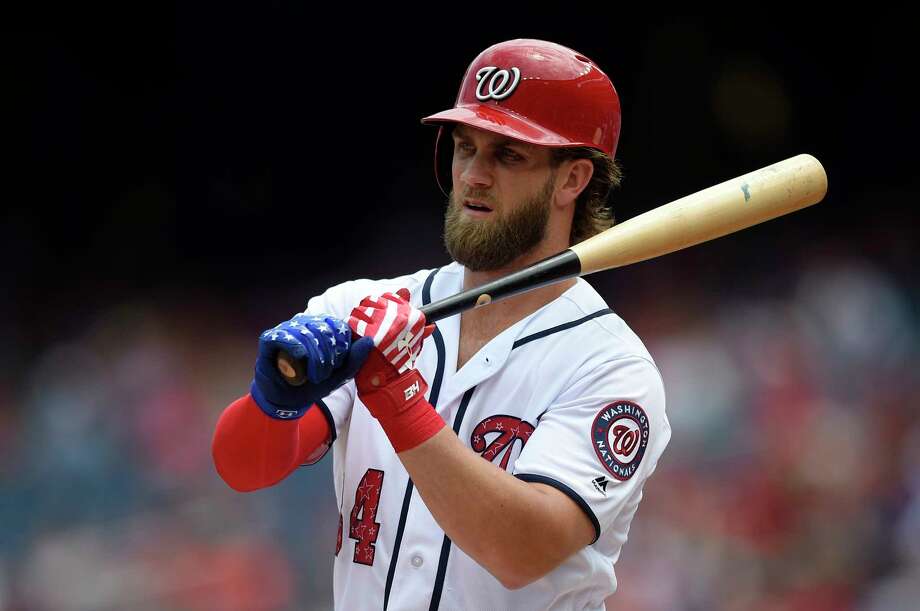
20: Washington Nationals stars and stripes alternate
Baseball has a real fetish with red, white and blue color schemes. Taking a knee around most uniforms can put oneself in real jeopardy of a Trump tweet. This is the one city that deserves to have it though. It would be weird if they DIDN’T have it. They lean into it to the max with the stars and stripes W uniform. There are a lot of things that make this combo appealing, but standing high above the rest are the incredible batting helmets. It’s rare for a batting helmet to be so good that it gets primary mention, but these do. The 3D logo takes advantage of perhaps the best stolen logo of all time (Walgreens?) and the matte red is perfect.
Pros:
· The W with the stars and stripes is likely to be a controversial choice out of these 6(!) jerseys. Here is why I like it. It’s the American flag. That’s why.
· The red piping down the center is nice and further connotes the idea of striping (even though it is vertical).
· The W logo reminds me of soft pretzels and Wegmans which is 12 percent of what I expect heaven to be.
· I like that the stars and stripes W extends to the hat. As a hat connoisseur, I appreciate a new hat to buy as much as anyone.
Cons:
· If you aren’t into America, I don’t think you would like these. Fortunately baseball is the Nation’s Pastime, so I’m guessing that has been mostly weeded out.
· I don’t love giant letter logos, but this one is more fun than most.
· The door remains open to have more fun with the belt. I’m not saying they need to fold a flag up and stuff it in there, but maybe a little more blue in this uniform wouldn’t hurt.
· The sleeve logo is not creative or interesting in any way. There are already multiple W’s on the jersey. Maybe mix in an image of the Clinton Monument or something.
* The NHL is a mix of tradition soaked consistency and wild, ever changing, expansion and moving franchises. This has led to some wilduniforms for someteams, and other teams not changing their logo for more than a half century. While we don’t tend to reward teams for past performance and uniform heritage, the older stuff generally tends to outlast the wild new products in terms of quality. While might be true in most sports, it feels especially true in hockey.
19: Vancouver Canucks white uniform
Our first example of indigenous people’s imaging being used in a uniform. I don’t always love this (to be covered later). Here it is used in the best way. First of all… why the hell hasn’t any major team named itself the Orcas? Orcas are way scarier and smarter than sharks. They are the water’s perfect killing machine. They are beautiful and could lead to some amazing jerseys. Ok, where were we? The uniform. These colors are remarkably similar to the old Hartford Whalers and would seem to have been assumed by the Canucks post the Whalers’ exit despite abandoning them originally when the Whaler’s first showed up. I like to think they have carried on the spirit of the beautiful Whaler’s uniform for the current generation. This was also a significant upgrade from the black red and gold and the world’s second largest V neck.
Pros:
· The Orca symbol is very unique and a great nod to the history of Vancouver’s indigenous peoples.
· This blue, green and white combo connotes the sea to perfection.
· I also love the Canucks older C logo with the hockey stick in the negative space. Designers who don’t use the negative space aren’t doing half their job.
· Smart use of the rounded numbers. Generally speaking things that are rounded are better from a design standpoint. Ask Apple.
· The blue/numbering on the sleeve prevents there from being too much white, which is a smart move.
Cons:
· Some points subtracted for the unbalanced striping. A little too thick with the green stripe.
· It’s mean to do this, but they remind me so much of the Whaler’s jersey I can’t stop comparing them.
· The blue uniforms are a bit much. I would love to see what a green jersey would look like though. (Because the Whalers had one)
· Apparently there was a lot of negative feedback when these were originally introduced due to folks feeling it was a shameless plug for the parent corporation, Orca Bay. At least this isn’t a Bobcats situation.
17. San Diego Padres pinstripe
The Padres returned this offseason to their traditional brown and gold and it was a LONG time coming. This uniform is the most transcendent use of brown in all of sports (and they are 19, so maybe it would be best as the only use). The only thing worth pairing brown with is gold, which is probably why other attempts lead to misery. The Padres SD logo is nice, yet unremarkable, but the real magic comes from the matte batting helmet. While some might scoff at the “trendiness” of the matte helmets, sometimes trends are a good idea. Like the trend away from leeches to modern medicine. The matte helmets pop, especially with the pinstriped uniform, which is more broken up than the straight brown one or white one. While I generally poo poo pinstripes for their awkward shapes in places, these are the perfect color and give the uniform a perfect balance of cream, brown and gold.
Pros:
· The Padre’s pumped up Friar logo is one of the best in baseball
· Brown and gold is fantastic together and very rare in sports.
· A three level collar/trim is always a nice touch to show depth
· The yellow trim around the letters brings out the brown so much better
· The brown and gold is a good call back to the early days, while the design is modern enough to impress. A nice meld.
Cons:
· Pinstripes are fine for the top, it’s the bottom where the issue lies. Any design that draws the eye to the ass is a con.
· Missed opportunity to go 3D on the helmet logo. This generally looks good.
16: Buffalo Sabres blue uniform
A few years ago the Sabres returned to their roots with these tight blue unis. The color combination is excellent and it is a major step forward from the Buffaslug. The blue and gold is a great combo and more blue is better than more gold. Bright yellow uniforms generally make me want to slow down, use caution and watch for falling debris. The Buffalo and Sabre crest is good, albeit fairly simple. It has been many a year since Buffalo has seen a buffalo since they were never native to the area. I would think the next incarnation might work as a chicken wing.
Pros:
· The white is all perfectly placed in this uniform to allow the Buffalo, Sabres, number and name to all pop correctly.
· The number on the front is unusual for the NHL. It works well here because the logo is small and simple. This would not work on a lot of uniforms.
· The striping looks good with the three stripes at various thickness levels. Like Christian Bale.
· This color blue fits better than the lighter blue from the past. This was a good melding of past and present.
Cons:
· I like when trim/collars have multiple colors, but not front and back.
· I know we aren’t supposed to count winning and losing, but Jesus.
* NFL uniforms are a lot different than the other major sports. There really are no logos or designs on jerseys, and not much creativity in the actual uniform design other than the helmets. Most jerseys have similar elements in them which can make comparison difficult. This makes the typically less relevant elements such as color scheme, helmet/logo design and fringe elements such as socks or pants more important. The NFL is a mixed bag of virtually unchanged uniforms (such as Vikings, Cardinals, Saints and Colts) and some that seem to be in a regular churn (Seahawks, Chargers, Jaguars, and Rams). Honestly, some uniforms or color combos just work and don’t need changes. Some very much do. Others endlessly search for a fresh look, and still others look like Donkey Kong put together the design.
:format(jpeg)/cdn.vox-cdn.com/uploads/chorus_image/image/46377652/usa-today-8139068.0.jpg)
15: Miami Dolphins dark teal throwbacks
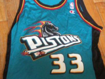
These uniforms are unique for a number of reasons. While aqua or turquoise are somewhat common colors in uniforms (think Hornets, Sharks, Ducks good uniforms, those weird old Pistons uniforms with the enraged horse, and that Islanders uniform that looks like it sells fish sticks) it is not common to find true teal. Yes there is a difference. Teal is by far the darkest of those. The newer Dolphins uniforms abandon teal to take on the color that they are actually known for: Aqua. For decades we have heard people say the Dolphins uniforms were “aqua and orange” but this has never been correct. They are NOW aqua and orange, and it’s a down grade. Football is not an airy and fun game. It is a brutal game that truly separates the men from the boys. Aqua doesn’t work. But teal does. The darker blue/green pops with the bright orange and white.
Pros:
· The striping looks fantastic with three colors perfectly spread around the color wheel.
· The older Dolphin logo also works more for me. The helmet on the dolphin is a little silly, but the white mixed in on the dolphin skin is a nice and rare touch to give a logo a sense of a third dimension.
· Of course the color scheme reflects the city (which you will see is a key factor elsewhere).
· I love when a team essentially commandeers a color, and the Dolphins have that with this teal.
Cons:
· The generic nameplate ruins the orange shadowing that works so well elsewhere by not matching.
· The helmet on the dolphin on the helmet is a little too Inception for me.
* Compared to the other leagues, the NBA tends to be more aggressive and modern with their uniform designs and options. Some teams have upwards of 6 unique jerseys. Third jerseys, alternate jerseys and throwback jerseys are the norm. Of course with volume comes a lot of misses. There have been some very terrible jerseys in recent years, and some lazy ones. Mostly, however, this works in the NBA. The NBA is viewed as the most progressive and inventive of the leagues and this often leads to unique ideas.
14: Chicago Bulls black with pinstripes
This throwback to the Jordan era Bulls (literally what other Bulls era would you want to throw back to? Derrick Rose?) takes advantage of the raw beauty of the black, red and white color combination. A black jersey with pinstripes and shorts avoids that distortion that occurs from time to time in the, uh, lower half in white jerseys, as that issue is not really noticeable here. What is noticeable is how the red pops on the black background, how the pinstripes back up the black so it isn’t as overwhelming as it is with the unbroken fully black uniforms (see #5) and how the white shadowing offers the numbers good dimension. Their red jerseys are also a great choice, but I love the way the pieces fit together here a little better.
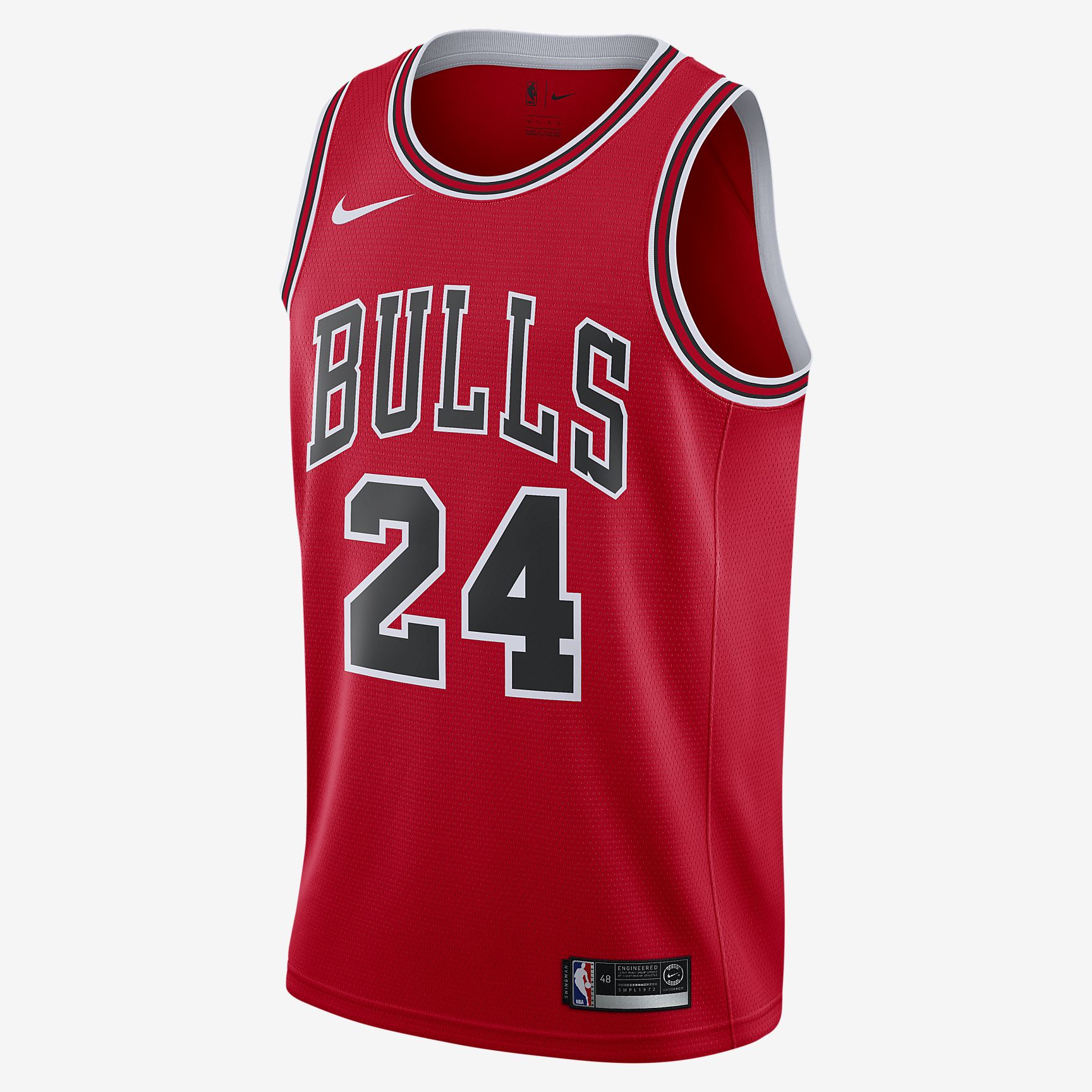
Pros:
· Black, red and white conveys aggression in a way few other uniforms do. The Raiders, the Pirates or Steelers (sorry penguins, but happy feet does not strike fear in my heart, even though Mario Lemieux might), and the old Timberwolves jerseys are some other examples of aggressive jerseys. I want my team to look either cool or tough. But not like this.
· The Bulls logo on the bottom side of the shorts has always worked well and keeps the shorts from looking too simple. Also, the four stars on the waistband that tie in to the city flag are nice.
· The decision to go with white/gray pinstripes is an improvement on the red pin striping of yore. It gives the uniform a more classic and less busy appearance.
· The black/red/black trim is a nice touch and offers good depth.
Cons:
· As a man who pitched everything on earth, Max Michael Jordan still didn’t wear an ad on his jersey for Pete’s sake.
· If you are a fan of simplicity, there is a lot going on here. Still, I feel it works together in a nice harmony.
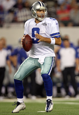
13: Dallas Cowboys white uniform
The Cowboys are a team that will probably never change their look. And they shouldn’t. This is one of the older uniforms that will probably always work. The star logo seems simple, but it is the logo of their country state flag. Nothing, and I mean nothing, is more Texas than the Cowboys. Oddly, even though they are called the cowboys, they neither dress like cowboys nor do they have a cowboy logo. No doubt the jersey itself is fairly plain. Normal font, mostly single color striping, number and nameplate. Here is where we get to something more interesting though. The pants. The pants on this uniform are neither blue, nor silver. Somehow, they are both. And this is what holds the uniform together. Somehow this color doesn’t clash with the main colors and accentuates them. There are plenty of visually pleasing elements to this uniform, but the perfect mix of colors is the key.
Pros:
· I know I already said the pants, but here is a thought, have you ever seen this color anywhere else? You probably haven’t and I love when teams create their own unique fonts, colors and designs.
· The star blue white blue pattern makes what should be a simple and boring helmet look sharp and have depth.
· A little hint of definition on the shoulder panels is a good move.
· Somehow this uniform combines 5 colors so seamlessly you can barely notice. This is VERY rare.
Cons:
· The general font and jersey itself is fairly simple and boring. I think they could slip the darker blue from the star around the brighter blue of the jersey to make these pop a little more.
· Maybe we could get something around the collar? Or something other than a stripe on the pants? Or something other than blue with the socks? Some uniforms are too busy, while this uniform will never be accused of this.
12: Oakland Athletics green with yellow/gold letters
The A’s have long been one of the top uniforms in baseball. Part of it is the unique nature of it. They are the only green squad in MLB. Most of the rest are drowning in a sea or reds, whites and blues. This aggressive uniformity opens the door for some unique combos to stand out (the Padres, the Orioles, the Pirates and not the Marlins). The A’s combo is gorgeous with the green and yellow/gold mixing well with the white. As is often the case with the A’s, the sum is more than the parts.
Pros:
· Again with the three level trim. Always a good touch
· I continue to enjoy the flourish extending below the script (thanks again Brooklyn)
· The A’s elephant is a cool logo. The story behind it however, is amazing beyond words. One of the first uses of logo trolling in history. Maybe the only one.
· I prefer this version to the giant A logo that has previously accompanied the all green unis. Typically, a giant A does not have a positive connotation, and MLB went through a giant logo phase, and it did not go well.
Cons:
· Missed opportunity to go with the gold belt to break up the run of green.
· It is weird that they stick a little more green jersey outside the trim. This is not necessary.
· The number font is very non-descript
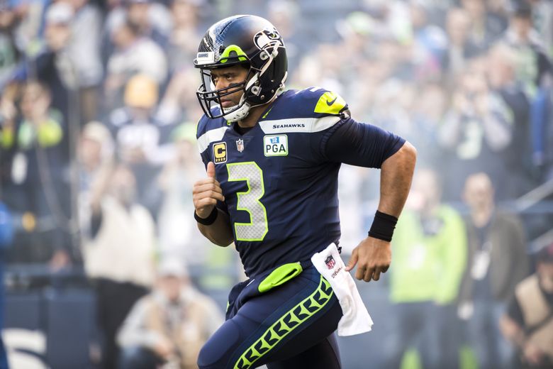
11. Seattle Seahawks dark blue uniforms
This is certain to be a very polarizing take. They are the one of only two teams currently including neon in their regular uniforms. The argument against it is that neon is a fashion style that comes and goes, like Zubaz. It is bright and gaudy. It sticks out like a sore thumb compared to the other uniforms. It doesn’t really reference their past at all. My argument for it is that it is okay to follow a trend to a certain degree. Matte batting helmets are a good trend. Bright accent colors are a good trend (unless you mix it with like 4 other crazy ideas). They give the uniform a depth that a closer color will not offer. Standing out is a good thing, not a negative. Anyone can produce a bland uniform that looks like all the other uniforms. The Seahawks did not have some great history of winning that needed to be hung onto. They just had that time everyone with Shaun Alexander won their fantasy league. More than anything… it’s fun. While football is a brutal sport, it is also… a sport. It’s ok to have fun. Save the decorum for the House or Representatives or the yacht club. I want my Icky Shuffle and Dirty Bird. A football field is not a church. As a bonus, two of Seattle’s teams have embraced the neon. One has not, ruining the possibility of having a Pittsburgh style city color scheme. That holdout has not won a championship recently. Or ever.
Pros:
· The logo itself still pops. The displeased hawk still works. The helmet as a whole has a more advanced look than most helmets with its underlying pattern.
· The unique shoulder pad area looks fluid and would seem to represent the airflow of wind on a hawks wings. Am I seeing things that aren’t there? I don’t know, I could never see those Magic Eye things.
· The very interesting patterns on the numbers and side striping are also unique and far more interesting than most other number situations in any sport.
· The right balance is achieved in these uniforms while the color rush makes me want to completely adjust my TV settings and the white one doesn’t create the uniform backdrop that really shows off the green. It is really easy with neon to do too much. The Seahawks mostly get it right.
· They have a number font that is as sharp and futuristic as the rest of the uniform.
Cons:
· While the helmet logo is ok, I really feel like there is room for improvement there. There is virtually no neon. Perhaps they will be one of the first teams to try out a helmet dip. I hope they do.
· Generally speaking, I don’t love it when the core color of pants and the shirt are the same. It can lead to a bit of a washout. Only the bright green saves it.
Well, that was part one… Come back next week for part II 10-1.