


Welcome to part 2! If you missed part one, go here. I will relist the ground rules here, however. Remember, more than anything, you clicked on this.
Some ground rules –
I don’t care how much your team won in that uniform. The Yankees, the Lakers and the Patriots don’t get special treatment because they won a bunch of blah blah blah in their uniforms.
I don’t care how long your team’s uniforms have been around. I don’t care if you are an expansion team that has played one game in the last year. If you exist and you have a uniform you have an equal chance.
I can pick any uniform I want. So your main jersey is a pile of chaotic colors and graphics that exist to honor a city you no longer play in? But your third jersey is glorious? Congratulations.
I will take the top 5 in each sport and rank them in comparison to one another. Is it possible the sixth best NFL team is better than the 5th best MLB team? Yep. Also, if you feel strongly about that, please let me know on my non-existent Reddit forum.
If your team’s uniform was great last year, but your team decided to do this, tough break. We are only doing current uniforms
/cdn.vox-cdn.com/uploads/chorus_asset/file/19884986/uni7.png)
10: Los Angeles Lakers yellow primary jersey
No, I am not awarding points for those Magic Johnson titles, those Shaq titles, those Kobe titles, and those Lebron titles (whoops). Sometimes a jersey just finds the perfect balance of bold and bright. I’m sure I will hear complaints that the Celtics aren’t on the list here when the Lakers are. So let’s take a second to address why they aren’t. There are two colors, green and white. I like the green, but it is hardly original or special. The font is as generic as it comes. There are no unique touches. Yes, it is a classic. Unlike some other uniforms on this list, if fails to merge the modern and past in any way. The Lakers, on the other hand, use a unique color, a unique font, effective number shading, and just enough touch ups to keep it sharp.
Pros:
· Purple is dramatically underutilized in sports. It is the color of both royalty and villainy. How would you not want that for your team? I’m not asking for a friend. I am asking for me.
· The font reflects the flavor of Hollywood and the Lakers connection to Hollywood defines their essence (the Clippers have only recently embraced their place as the common man’s team, which should have been their thing all along. Viva San Andreas font).
· The purple side piping on the shorts is one of the better shorts looks.
· As mentioned, the slight white shadowing on the numbers is another small nice touch that makes the purple pop.
Cons:
· Ads dammit. For those who do care about the history of these uniforms, this must be sooooooo upsetting.
· I will never understand why they kept the Lakers moniker when they moved from Minneapolis. It’s not Jazz level bad, but I have been to LA, and lakes are not their thing.
9: Milwaukee Brewers solid navy blue
The Milwaukee region is known for its sartorial style in sports. Both the Brewers and the Bucks have shown a flair for quality design. This year the Brewers went with the shotgun approach, unloading nearly a handful of uniforms on us. This is fine in this case, since most of the uniforms look sharp and the region’s continued use of cream (it is cream city) is a huge plus. In general, I prefer a cream uniform to straight white. It has the effect of sepia on a photograph where I feel a hint of nostalgia creeping in. In this case, the uniform focuses on navy and gold which is excellent as a combination.
Pros:
· The Milwaukee script is excellent, with the flourish I enjoy on baseball uniforms, underlining and providing a sense of context to the word mark (the Dodgers were leaders in this regard).
· The Brewers logo morphing a M and B into a glove remains one of the better logos in baseball. The Milwaukee region’s use of negative space is excellent.
· The gold piping trim is a nice touch to accent the blue and keep it from getting too dark.
· The new Wisconsin state logo is also a plus logo.
· The goldish yellow and blue hats that are going with this are excellent and a top 5 MLB hat.
· This is another example of melding an older style logo with a modern rebrand. An excellent melding once more.
Cons:
· Having five logos for your team feels like over branding.
· No third color to offer perspective.
· Should we start to subtract points from teams with more than 3 jerseys? I feel like maybe if you shoot your shot enough times, it’s gonna go in. Let’s just call this the Arenas Corollary (I thought about Kobe corollary but it’s probably too soon, so here’s an article about a player Kobe thought shot too much)
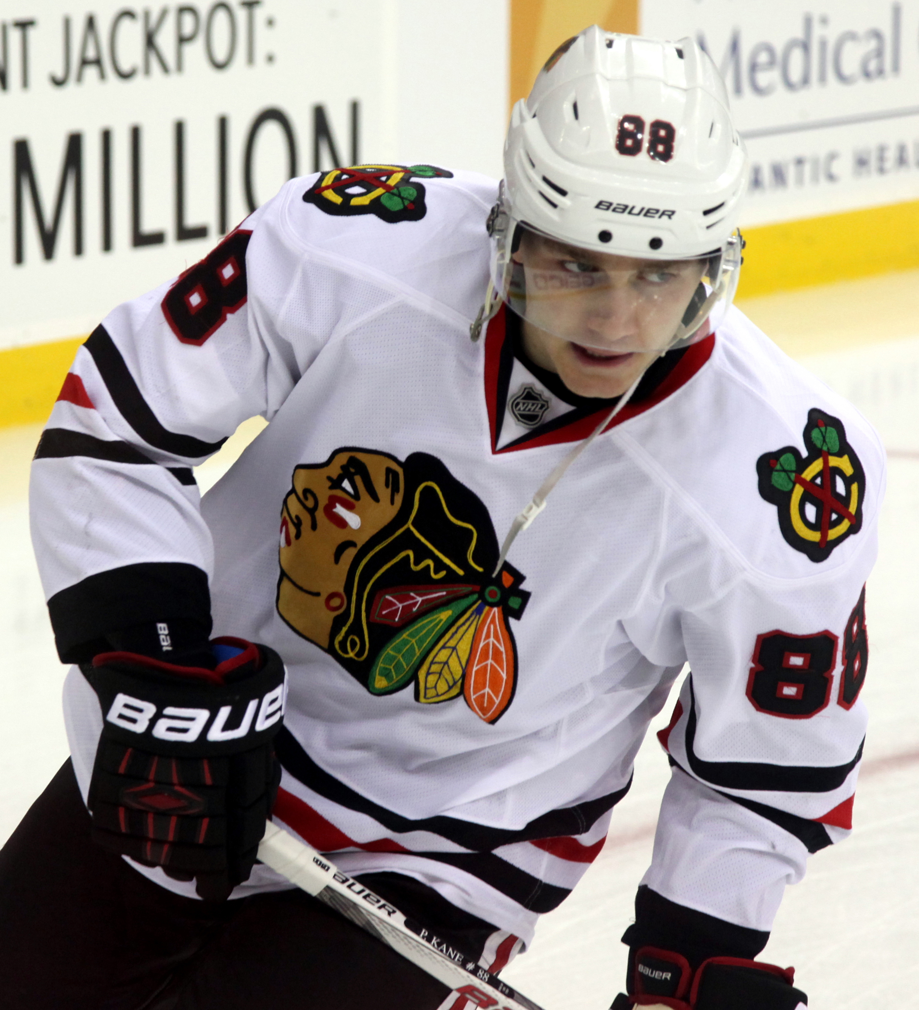
8: Chicago Blackhawks White Jersey
Party on Wayne! These beauties stand the test of time more than the other original six uniforms. The dilemma for the Red Wings and Maple Leafs is their uniforms don’t have a tertiary color. You might be surprised how important that third color is, but it is critical for maintaining depth and creating effective striping. Los Habitants and the NY Rangers both suffer from the universal, yawn inducing RWB combo (although I will grant the Rangers that their sash style word mark is unique and almost got them on the list). The Bruins were a very late cut. If they fire off a uniform again with their actual bear logo they will make the list. I am a sucker for a quality bear logo. The B with spokes is a little blasé. However, the perfect color balance, rare honorable visual representation of a Native American in sports (yes the Blackhawks insist the name doesn’t come from native culture, but, uh, there is huge chief head on their jersey.) and great color combo choice. And Clark Griswold had one, and I pattern way too much of my life on him.
Pros:
· The complexity of the logo really pops in a league with bland simple logos.
· The striping is beautiful. It balances the Jersey and logo perfectly.
· The tomahawk C logo is cool and also incorporates the color scheme from the feathers of the headdress.
· I enjoy the color more than most 2 stripe colors. The extended red portion adds more color to the jersey.
· I like the white more than the red because it allows the colors to be more in balance and the red swallows the logo a bit.
· Blackhawks is unquestionably a cool sounding name.
Cons:
· Native American logos remain controversial. Generally, from my point of view, I try to weigh both the intent and the way it is received by those it represents. In general, this logo is in much better standing than the Washington racial slurs (who will never make this list without a name change) and the Indians logo which is was shockingly offensive until it was removed recently (while removing this image helps the Indians opportunity of making this list, their plain bland font, logo and uniforms don’t). Also, this is venturing far afield, but Indians was a name given by people who were so lost they named the locals after a country that is almost as far away from here as is possible. It doesn’t exactly reflect well on the Europeans that landed here and then lived here for more than 500 years that they still haven’t figured that out yet and stopped calling them Indians. While the Blackhawks logo feels more respectful than most, and the name is solid, it has its detractors.
Not much else. These are very clean looking.
7: Denver Nuggets Rainbow Mountain
:format(webp)/cdn.vox-cdn.com/uploads/chorus_image/image/65974924/1190485069.jpg.5.jpg)
A perfect melding of past and present, these jerseys take everything that is great about the 80’s rainbow and modernizes it for the current culture. The font is improved form the 80’s (hard pass on mixing upper and lower case letters at random).The black is a better background then either the blue or white from the 80s. The digitized rainbow and city skyline pleases the Minecraft crowd and those 80’s gamers like myself. Most of all, it reminds me of a time when scoring 160 points can still mean you lose by 10.
Pros:
· Look, it pretty much uses all the colors. So kudos.
· I enjoy the off centered number location. No, the number doesn’t always have to be in middle.
· Jokic himself actually looks like a snow capped Rocky Mountain peak while wearing these.
· The small pick ax logo on the waistband is excellent. Belt area accents are good.
Cons:
· The black short with very little else on them is a little too much black for me. From top to bottom, it looks like a rainbow over a black water river.
· I will always dock points for spoiling a jersey with ads.
· Again… why are these the third jersey? Their main jersey is boring.
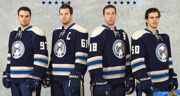
6: Columbus Blue Jackets cannon fodder
OK, perhaps that was misleading. This is the good kind of cannon fodder. I will admit that for most of their existence I had no idea what a Blue Jacket was (definitely probably not some new bee that is threatening humanity). It turns out those civil war clothes the north wore came from Columbus. And thank God, could you imagine if we had let Under Armour design them? Anyhow, a source of championship uniforms once, a champion again. These uniform look sharp, historical and fresh at once.
Pros:
· This is a rare example of silver and blue as a uniform combination and it looks great. The three color striping is effective. And it actually uses four colors total, in perfect balance.
· This is also a rare example of a unique font for numbers in the NHL. For a jersey that references history this is a great choice and the pointed numbers work with silver accents.
· Of course the cannon logo is very similar to the Sabre’s logo. It is fairly simple but appealing to the eye.
· This is also our first look at the shoulder pads color block. This is a moderately used look, and it connotes a general’s shoulder pads.
Cons:
· The single color trim is bland and a missed opportunity to use the silver, white and blue to great effect.
· I like the star on the main logo. I wish that had been worked in elsewhere on the uniform… possibly on that very bland color.
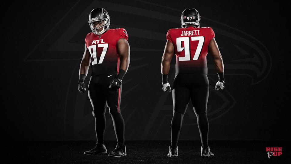
5: Atlanta Falcons alternate alternates
The Atlanta Falcons set fire to good taste this offseason and continued Atlanta’s recent tradition of wild uniforms. Most of what they did deserves to be in a very different article about how it should be impossible to misuse the wonderful black, white and red combo. There is one… lone… exception. Unlike the color fade (a bad trend that is suddenly starting to crop up) or the insistence on having ATL on the front to crowd everything or wild stylized Falcon of the current helmet or a terrible font with nonsensical shading, this uniform goes back to basics and works in a perfect balance of BWR. Starting with the simpler and more geometrically friendly falcon, to the nice striping of the socks, this uniform creates a balance that just looks good. Sometimes, doing everything well and nothing poorly is great.
Pros:
· I might have actually buried the lede here though. The helmets are matte. This is the second (Vikings) NFL matte helmet in regular rotation. This version of the uniform uses the ATL in a very small spot on the front of the helmet which works a lot better. Being creative with the helmet is a huge plus. Also, the absence of a stripe on the helmet really looks good.
· The geometrically friendly hawk helmet using black and white saves the red for the pants, shirt and socks so it pops there. The logo also fills the helmet nicely and looks really good on the sleeves.
· The number font is fine, but as always, a three color look brings depth and interest.
· The striping of the socks is less common than you think and looks very good here. For what it is worth, I think striped socks almost always look better than solid. And they make you look taller.
Cons:
· These are fairly simple overall, the striping, the number font and the logo are all pretty ordinary. Not everything needs to have flair to work though.
· There is nothing wrong with these uniforms. This is a good example of simplicity shining, with cool features popping out here and there. If my eyes weren’t still bleeding from looking at the other jerseys they made, I might have rated them higher.
4: Golden State Warriors 2020 The City throwback uniform
These uniforms are amazing. They are basically unchanged from when they were introduced 50 years ago. They were ridiculed upon their initial release. In the end they proved highly prescient. The circle logo instead of a word block, the cable car number overlay that placed the numbers in negative space (one of the first NBA uses of negative space), the use of a city nickname instead of the city name, the use of an iconic landmark and a tie in to cultural music (Tony Bennett’s I left my heart in San Francisco). The Warriors brought them back a few years ago (praise jebus) and now have brought back, created and unearthed every jersey possible.
Pros:
· I listed the innovation this uniform brought that has been copied by so many teams since. Somehow one jersey did all of this.
· The font is original and unique (and TWO fonts at that)
· This all actually makes sense now that the Warriors are back in San Francisco
· Somehow a jersey made 50 years ago is dramatically better than almost all of the current uniforms today. It’s the Polaroid camera of jerseys. I want a physical picture right now dammit.
Cons:
· Back when these were created, those people from Mad Men were creating ads and even they didn’t think to put them on jerseys.
· The name under the cars is a little annoying if you are trying to actually read it mid game, although it is yet another innovation.
3: Pittsburgh Pirates black with yellow script
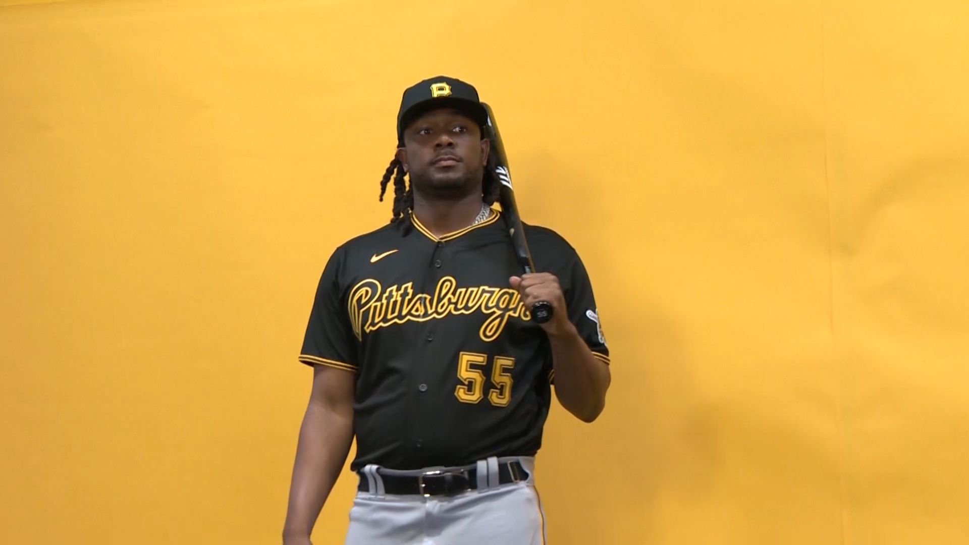
Pittsburgh is unique in the sports landscape in that all its major sports team have adopted the same color scheme, giving the area a uniform uniformity that is unmatched. That certainly adds to the appeal of these uniforms, as they perfectly represent what Pittsburgh is about. Hardnosed blue collar industry (although that has changed a bit in recent years, as tech jobs have infiltrated Pittsburgh). The yellow and black is meant to be intimidating, conjuring images of a steel curtain defense, a young, mustachioed, mostly ‘roid free Bonds and hardnosed Hockey team with more than their share of transcendent skill. Here it creates the most badass and intimidating uniform in baseball. It’s basically the opposite of the friendly Cubs uniform (which I like, but let’s not pretend it’s a real bear).
Pros:
· As usual, the three tiered collar/trim stands out to create depth on the fringes.
· The script font is excellent and avoids being too soft here (some scripts might weaken this alpha male look).
· The number font matches the Pittsburgh aesthetic.
· I generally prefer baseball uniforms that include a number on the front. One, it makes it easier to identify the player when you are a half mile away, and two it keeps the script balanced and offsets the new Nike logo (I am not punishing baseball for having a Nike logo. They are the jersey manufacturer and deserve a presence. Wish(an Amazon-like app for people who want to buy garbage made by the sweatshop other sweatshops buy from) on an NBA jersey does not.
· Yet another beautiful matte batting helmet. Keep ‘em coming.
Cons:
· The pirate face could be better. I would go with something more abstract myself. Or at least someone who doesn’t look like they have been a server for 20 years in a pirate themed restaurant that has gone way downhill.
· The shimmery material is going to clash a bit with the matte helmet. You should go one way or the other.
· Missed opportunity to have a yellow belt. I think that would have been a cool touch.
These uniforms track on an entirely different level than traditional uniforms. Everything about them is unique to the uniform. The coloring, the font, and the layout are special. I hope these uniforms open up a new portal for uniforms to branch out beyond just being a source of information and convince teams to connect more with the local flavor of a city. Maybe Miami is just fortunate in that the city as a whole has such a fun and colorful vibe to it thanks to the immigrant population. This uniform finds the perfect line between creative and bold, and just subtle enough that it isn’t too much. The soundtrack to Drive plays in my head every time I see them. These also would have won if they didn’t have a damn ad on them. Don Johnson and, uh, Tubbs would be very proud.
Pros:
· There has never been a more perfect marriage of font and city
· The colors fit the vibe of Miami as well
· Uniforms will always receive special credit from me when they incorporate a rarely used color. In this case pink accents. Pink is probably the rarest major color in sports.
· The black white and pink striping around the fringes are a fantastic accent. AND BLACK AND PINK SHADING!
· The Miami Heat logo on the center of the shorts is a nice touch.
Cons:
· The blue is a step down from last year’s pink and black. In particular the black pops.
· The ad.
· For some reason these are still the third jersey. Why do they even have those other jerseys?
1: Carolina Hurricanes Hartford Whalers
God has smiled down upon us this season and allowed me to cheat and include a team uniform for a non-existent team this year. Carolina has decided to honor its roots and sport Hartford Whaler jerseys for 2 games this year, making them eligible for this list. Why does that matter? Because the Hartford Whalers have the perfect sports logo. The color combination is so spot on that the jerseys will outlast the team for a hundred years.
Pros:
· As mentioned already, the logo is a masterpiece of simplicity, use of negative space and uniqueness. It was done in a week. These days a rebranding effort can take years, and if it doesn’t the results can be disastrous.
· The green and blue is beautiful, perfectly connoting the sea. Once again, a fairly original color combo makes a huge difference.
· Whalers is a great name that fit well with Hartford. Just compare it to the new name when the team moved south. They have “Carolina” residents cheering for something that actively destroys their homes and kills their family members.
· The blue and white striping perfectly accents the top and gives the impression of waves breaking. Holy cow this uniform is amazing.
Cons:
· These only exist for 2 games. And you can’t go back to this logo unless they start playing in Hilton Head and change their industry from making sour tasting vinegar BBQ to whaling.
· Whaling is… not very popular or common at this point.
· The number font is fairly non-descript. I feel like a bad person for criticizing these.
Ok, that’s it. I cheated the hell out of that number one ranking and I am so proud of myself. For everyone who is mad their team didn’t make it, don’t call me Ishmael. Or text me.
“I know not all that may be coming, but be it what it will, I’ll go to it laughing.”
I will leave the comments open.